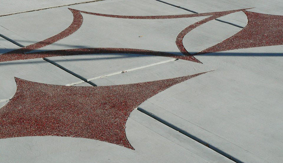
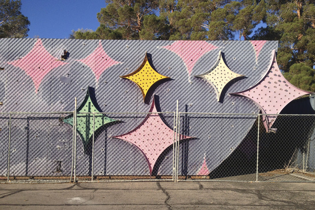
 Photo: Rebecca Holden Rebecca Holden is a visual arts specialist with the City of Las Vegas. On Facebook, she shared photos from the 2009 dedication of 'Atomic Passage” in the Arts District. That is a public art project most in the city know of; the embedded designs in the sidewalk paired with custom white benches. What was news to me is how the design on top of the benches mark the original 18 blocks, aka 18b, that once designated the Arts District. Now there is talk the name is obsolete because creative-themed businesses expanded beyond the 18b. That should not matter. The 18b is still the center that branded an area that reflect art. But that is for another meeting in another time and place. Back to the star of this public art project; the star itself. As I noted three years ago, almost to the day, the star used in the design gives Las Vegas a distinct visual reference. My POV came about when Richard Hooker, curator, artist, and the former senior cultural specialist for the City of Las Vegas, was giving a tour of public art. We crossed paths and he asked me "What do you think is a symbol for Las Vegas?" I had an answer. I've seen on sidewalks and signs. It’s that four-pointed star, I said. Later I wrote:
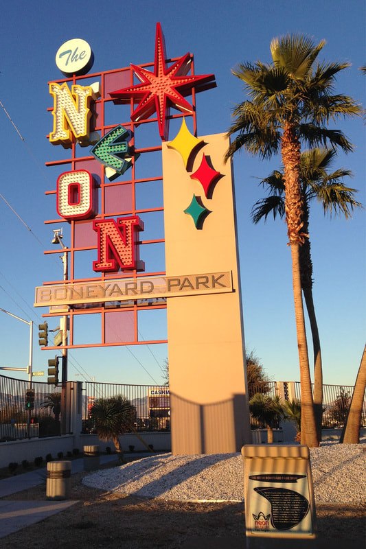
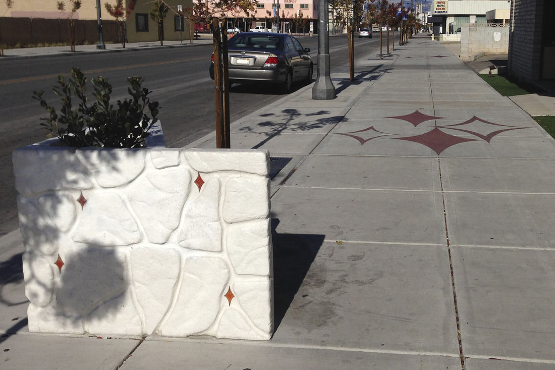 "Atomic Passages" (2009) are stars on sidewalks and benches benches credited to Atomic Industries and artists Danielle Kelly, Adam Morey, Aaron Sheppard, and Erin Stellmon. Casino Center Boulevard between Charleston Boulevard East Colorado Avenue. Photo: PaintThisDesert 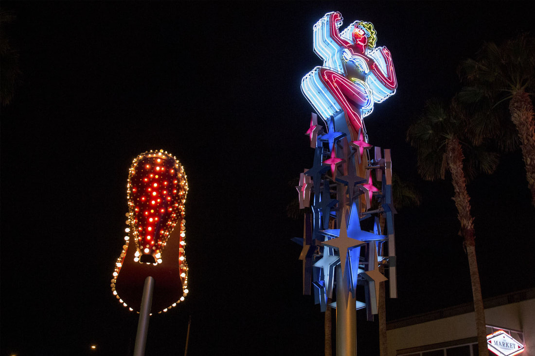 Neon sign on Fremont Street has four-pointed stars homage. Photo above and below: PaintThisDesert
Meanwhile, back at Holden's Facebook post, she wrote that the "benches have recently received some much-needed love and attention, including the removal of layers of paint/debris and a fresh coating of paint, topped with an anti-graffiti coating. We're fortunate to now have the resources and materials to maintain and conserve these works of art." She recommends that if you see something amiss on the benches, like graffiti, stickers, random garbage, and so on, you can let the city know by emailing [email protected].
0 Comments
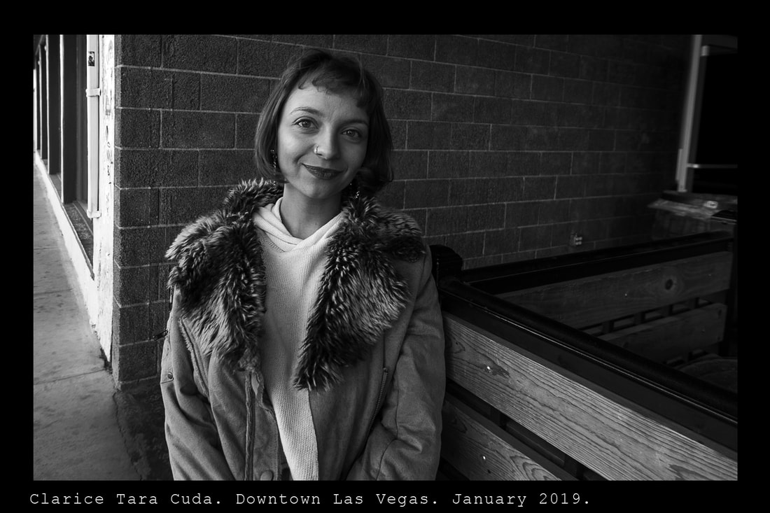 Clarice in Downtown Las Vegas Photo: Ed Fuentes Not many in Las Vegas consider Clarice Tara Cuda the kind of artist who needs encouragement. Anyone who keeps track of the local art scene has seen her work and she can be considered one of the wisest artist who has landed in town recently.
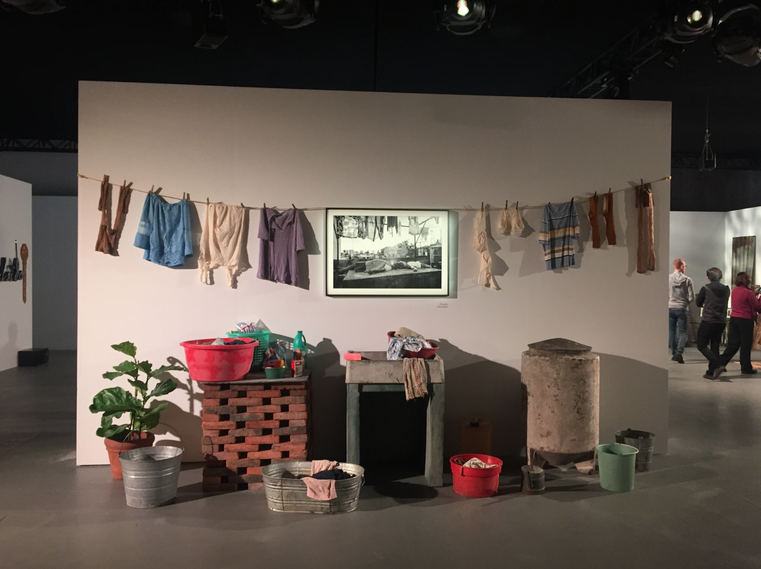
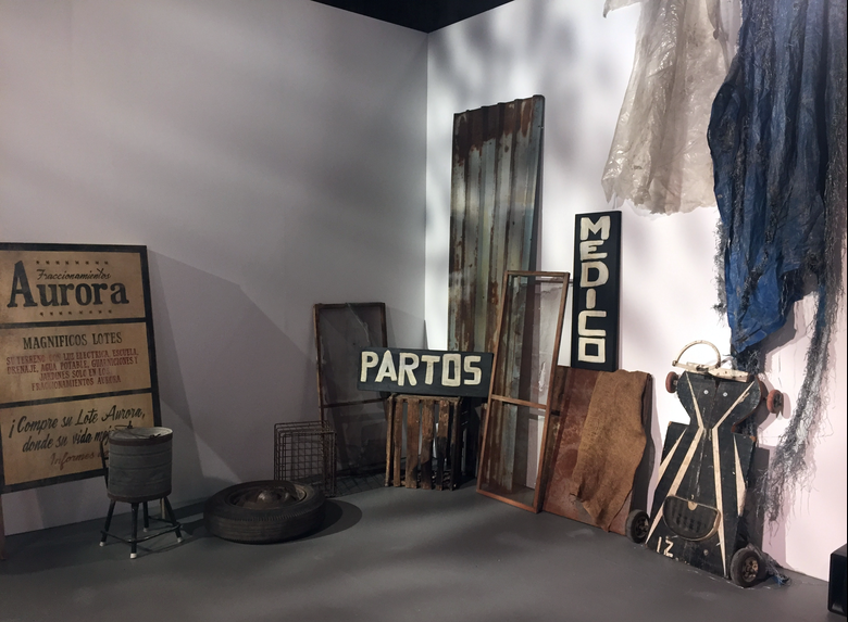
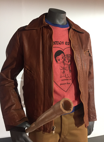
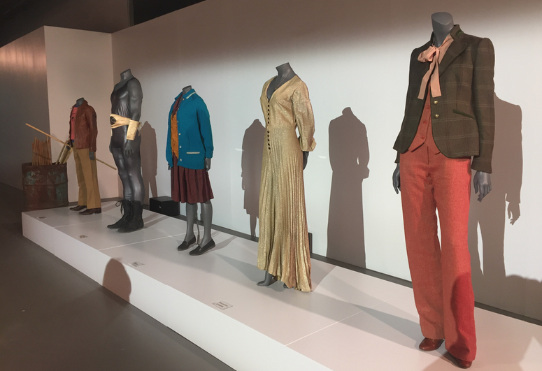
It came after hard thinking and listening to herself. In fact, you can feel her listening to you as she studies your gestures, sometimes glancing away to break from eye contact briefly, then quickly return to create an honest moment. Like describing herself as someone who once missed making art and decided to take her work seriously. That came after some reflection. “I knew in my heart that…” she starts to say, as if a reluctant confession was about to escape her “I know I didn’t put in the work.” Then she beams a smile that says she knows art is about curating moments. Clarice reintroduced herself to her inner creator by working in a tattoo shop where she revisited her skills in capturing the details of forms and shapes. Then she worked a desk at a local gallery. That also helped. It was there she displayed her, what was then new work, and met the local art community one person at a time. She had courses at CSN and UNLV. Clarice says it was a UNLV sculpture class that changed the way she produced ideas. Also, it was there she began to understand how a body, hers, could be an art subject, not object, infiltrating physical space that details her personal philosophy. Right after earning her BFA she changed the expectations of a growing clan of followers with “Dissonance,” a performance of live binding with fish line that was a spiritual declaration of “taking away the traditional concepts of beauty in the body.” Despite her constant weaving of ideas and materials, Clarice is consistent. She challenges outdated declarations of beauty. That was seen recently by her wearing a 1950-ish outfit while lights bathed her in pinks and blues, all symbols of gender roles, while posed behind a display window of a former retail store. It was a concept and performance that came from a collaboration with Amanda Keating. People stepped up to the quiet spectacle and were encouraged to replicate gestures; an intimate mirroring of movement. For the artists, it was about moving past pain and love by using small gentle slow gestures that quietly coaxed and dared viewers to mirror emotions. Sometimes she allowed them to take the lead, which she gave them, so she can gently take it back. Then it was kept in a safe place for both. Some want to infiltrate the physical and emotional space. They couldn’t. A barrier was there; a thick glass window. That was at “Still Life” for Art Basel in Miami produced for Raw Pop Up. Just this year. Art Basel. Clarice is not yet 30. Only a few years ago her creative space was a tattoo parlor. Now she protects her art within a protocol of performance, a safe barrier that allows her eyes to listen. 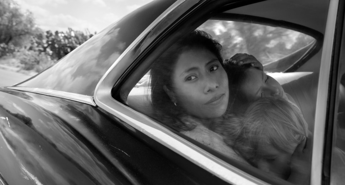 NETFLIX ROMA washes over you from the very first frame: the scrubbing of driveway tiles set against the sights and sounds of Mexico City. Oscar winning director Alfonso Cuarón’s latest film, ROMA, is a NETFLIX limited release. It tells the story of Cleo (played by newcomer Yalitza Aparicio) an indigenous domestic worker in Mexico City’s Roma neighborhood in the early 1970s, and the relationship with the middle-class family that employs her. As Cleo’s life crumbles, so does her employer’s marriage, along with the city surrounding them. When Cleo discovers she is pregnant and the child’s father, Fermin (Jorge Antonio Guerrero), abandons her, she confides her predicament to her boss, Sofía (Marina de Tavira.) Expecting to get fired Cleo is surprised Sofia offers help. When the two women face uncertainties side-by-side, the story starts to convey how the nuances of race and class have not disappeared from Mexican society, as well as the underlying political climate that would ultimately transform the country. The early 1970s was a volatile time in Mexico’s capital with its student protests and police massacres. It underscores the characters’ personal upheaval. The sounds of the city and popular music reflecting lost love and poverty almost serve as a warning. Shot in immaculate, grain free black and white and drenched in stunning detail, every inch of the frame reveals a different clue to character, place and story. The NETFLIX feature film release is ideally viewed on the big screen to fully appreciate the silent storytelling throughout. At a ROMA event at Raleigh Studios in December, the director, cast, and key crewmembers shared experiences of their recent collaboration. It all starts with the script. . . sort of. While Cuarón did write a script, he did not make it available to his department heads and talent – sometimes right until close to filming (reminiscent of British director Mike Leigh) - and after much preparation and key decisions were made. The director’s approach was experiential; guiding cast and crew through his personal experience to time and place. He enjoyed long conversations about the Colonia Roma he knew as a child, and sharing his experiences of music, sights and sounds as points of reference for this semi-autobiographical picture. In-sequence shooting over 108 days revealed the story in small bites to cast and crew. The story is rooted in Cuarón’s youth. The character of Cleo is based on Liboria “Libo” Rodriguez, Cuarón’s real-life nanny. Sofía is based on his mother and the other characters include his family as his parents separated. Pepe (Marco Graf) is modeled on Cuarón himself and much of the film is based on his own memories yet seen through Cleo’s eyes. He cast actors and non-actors in key roles, including Aparicio who had just finished training as a school teacher before she was cast as the lead in her first film. The director admitted taking great delight in throwing curveballs. Sometimes he gave each actor a different version of the script, creating a “beautiful chaos” that allowed for improvisation. De Tavira described her surprise at Sofía’s children behaving one way during one take and completely different in the next, all at Cuarón’s direction. All that, plus multiple takes and angles, would later take a toll on Cuarón and editor Adam Gough in post-production. The results are extraordinary. Cuarón’s team recreated a Mexico City that hasn’t been seen in decades. “It’s a dream project for a production designer . . . except for the idea of not having a script.” said production designer Eugenio Caballero. So much of Mexico, including Cuarón’s childhood home, had changed and was unusable as a location. Caballero and set decorator Bárbara Enríquez worked with Cuarón to recreate his original home by using the façade of a house across the street, that was up for demolition, to capture the spirit of the original residence. They even tracked down furniture from Cuarón’s family to use for set pieces. Production worked to make every detail match Cuarón’s memory as close as possible. They found craftsmen to create tiles, as they had been manufactured 70 years ago, to get the authentic look and texture. Every detail – down to drawers that never opened on camera- were filled with specifics at Cuarón’s direction. They even scouted for toys from that era. It gave the director, crew, and talent a sense that everything was real. A major challenge was re-creating Insurgentes Avenue, which now looks nothing like it did in the ‘70s. Azteca Stadium parking lot was not big enough. Production resorted to Google Earth to find a place that had room to recreate the two blocks they needed. That included room to create full storefront sets in case Cuarón wanted to go inside and film an interior scene. The result was mesmerizing, and extended takes were possible. Such as Cleo chasing her young charge down this street on the way to the modern movie theater, which itself was a narrative contrast to the run-down theater the character frequented. Working in black and white, textures and light values also played a key role in every department’s choices. Cuarón served as his own director of photography. Longtime friend and collaborator Emmanuel “Chivo” Lubezki, the original cinematographer, bowed out when the film schedule ran long. Nevertheless Cuarón found Lubezki’s pre-production help invaluable.  ROMA panel at Raleigh Studios. Photo by Maria Lopez At the Raleigh event, Lubezki asked, “Why black and white?” For Cuarón it was about Cleo’s character and creating a modern film that looked into the past. “It’s not a vintage black and white. It’s a contemporary black and white.” Replied the director “Black and white was part of the DNA of the film.” True to the film’s DNA, costume designer Anna Terrazas took much into consideration in regards to how wardrobe would work in monochrome. Terrazas often checked with the director to talk over the light values and contrast of fabrics. “One of the things we did was playing with the textures of the clothes,” she said. “Obviously, it was the 70s but again, one thing in Mexico is the 70s wasn’t the 70s in the U.S. We were a little behind the fashion, so that was also a big challenge.” The wardrobe contrasts in the film are apparent not just in Cleo’s clothing, which starts in white then moves into darker shades and finally returns to white in the end. It’s also felt in the Hacienda scene, where the family spends New Year’s with friends. The wardrobe of upper-class Americans and Europeans is a flow of modernity. The clothes of servants speak to the class divide. The plain, older, stiffer styles with their hats and ponchos to fight the cold separate the two worlds aesthetically. The class divide is also apparent in the deadly land disputes mentioned in passing throughout the film. In the end, despite the changes the world around them demands, Cleo’s genuine love for the family, their love for her, and their newly formed bonds do not stop them from the entitlement and sense of obligation that keeps each character from stepping away from the prejudices of race and class. BELOW: Wardrobe and set pieces from ROMA at Raleigh Studios. Photos by Maria Lopez
  María Margarita López has covered arts and performances for former sister blog, viewfromaloft since 2011. As a film producer, she is co-founder of Ajuua Entertainment, plus consulted and produced media under her company ValorFilms since 2005. To add, her short film, GUILTLESS, was selected to be screened at the CCCM Mexican Center for Culture and Cinematic Arts (Mexican Consulate) on January 10.
|

An Online Arts Journal

Exhibition:
February 2 – March 31, 2019 Artist Reception and Gallery Talk: Sunday, February 10, 2019, 4 p.m.–7 p.m. 
S P O N S O R
ARCHIVES
January 2019
TAGS
All
|